Pop-up forms: what they're for, and how to tell if yours is working
The form that turns an anonymous visitor into someone you can email. Your welcome flow and your browse abandonment emails both depend on it, so it deserves more thought than the artwork.
- 105Pop-Up Form
- A small, on-screen form that appears to visitors on a website, often used to collect email addresses or promote special offers. Pop-up forms can be triggered by various actions, such as scrolling, exiting the page, or spending a certain amount of time on the site. They’re a powerful tool for building email lists and capturing leads.
- Main job
- Turning a visitor into a profile Klaviyo can email
- Formats
- Pop-up, flyout, full page or embedded, with a teaser to reopen it
- Judge it by
- What its subscribers go on to buy, not the submit rate alone
- UK consent
- A plain sign-up, nothing pre-ticked, texts opted in separately
A pop-up form is the front door to most of your flows
Klaviyo can't email someone it can't name. Until a visitor signs up, buys, or clicks through from one of your emails, their browsing is anonymous, and your browse abandonment flow has nobody to send to.
So the pop-up isn't a gadget bolted onto the theme. It's the point where a visit, often one you paid for, becomes a relationship you don't have to pay for again. Miss it, and getting that visitor back usually means paying twice.
Pop-up, flyout or embedded: which format goes where
| Format | Where it sits | Where it earns its place |
|---|---|---|
| Pop-up | Over the middle of the page | Your main sign-up offer |
| Flyout | Slides in from a corner, page still usable | Product pages, where someone's mid-decision |
| Full page | Covers the whole screen | A launch waitlist, where signing up is the point of the visit |
| Embedded | Built into the page, often the footer | People who went looking for it |
| Teaser | A small tab at the edge of the screen | Reopening a form someone closed |
Most shops need one main pop-up designed for the phone first, a flyout on product pages and a form in the footer. Add more and your forms start queueing up for the same visitor. The settings that decide whether any of them work are in our pop-up best practices guide.
Judge a pop-up by what its subscribers buy, not its submit rate
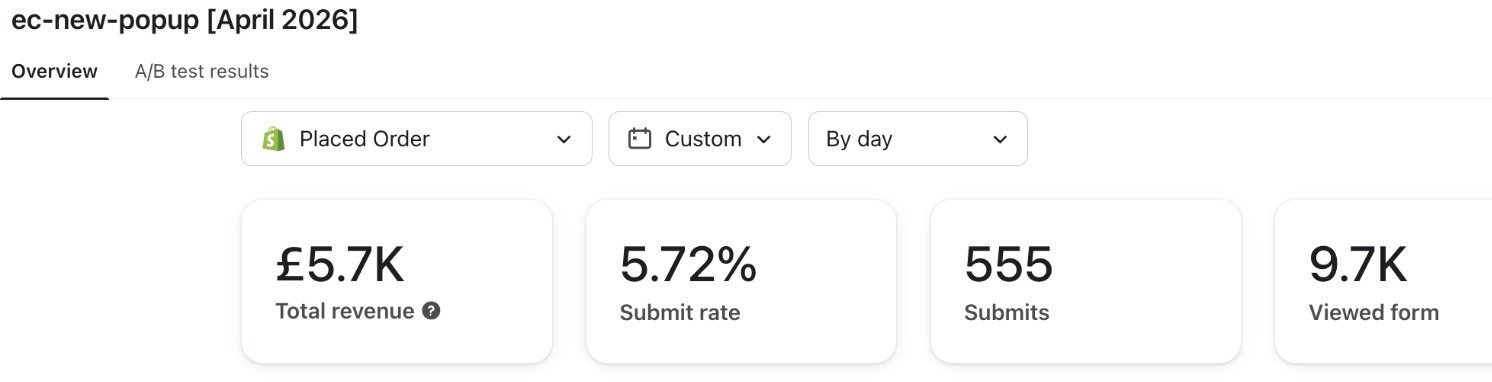
Submit rate is the number everybody screenshots. It's also the easiest one to inflate: a bigger discount, an earlier trigger, a close button nobody can find. All three fill the list with people who wanted the code and nothing else.
Klaviyo's report for each form puts the revenue it's credited with next to its views and submits. Read those together, then check what your welcome flow did with the people it collected. A form that collects fewer addresses that buy is the better form.
What the sign-up wording has to say under UK rules
A pop-up sign-up is consent, and the ICO's guidance on email marketing is plain that it has to be consent to email from you. So say what people are signing up for. Nothing pre-ticked, nothing tucked into the small print.
If the form asks for a phone number too, texts need their own opt-in. None of this is legal advice. It's the minimum we'd want to see before a form goes live.
Related terms
FAQs
What's the difference between a pop-up and a flyout form?
Position, and how much it interrupts. A pop-up sits over the middle of the page and stops the visitor until they answer it or close it. A flyout slides in from a corner and leaves the page usable. Use the pop-up for your main offer, and the flyout where someone's mid-decision, like a product page.
How long should a pop-up form wait before it appears?
Long enough for the page to load and the visitor to see what you sell. A short delay or a bit of scrolling usually does it. Firing instantly interrupts a page that hasn't finished drawing, and it greets people who just clicked through from your own email. Set the form to skip existing Klaviyo profiles while you're there.
Should my pop-up form show on mobile?
Yes, but built for the phone. On a small screen the form takes over the whole page, so keep it to one field, make the close button easy to hit, and don't fire it the moment someone arrives from a search result. A teaser tab in the corner is the gentler way to keep the offer on screen.
Rather we explained it on your own account?
Bring your Klaviyo account to a growth consultation. We'll walk through what this means for your numbers, in plain English, and what we'd fix first.


Half an hour with Theo, our founder.
We're all about relationships built on trust, mutual respect and a shared vision for success. If that sounds like your vibe, let's make some waves together 🌊