Klaviyo pop up best practices: the settings that decide whether a form works
Most forms fail on targeting and timing rather than design. The settings that decide it sit behind the editor, not inside it.
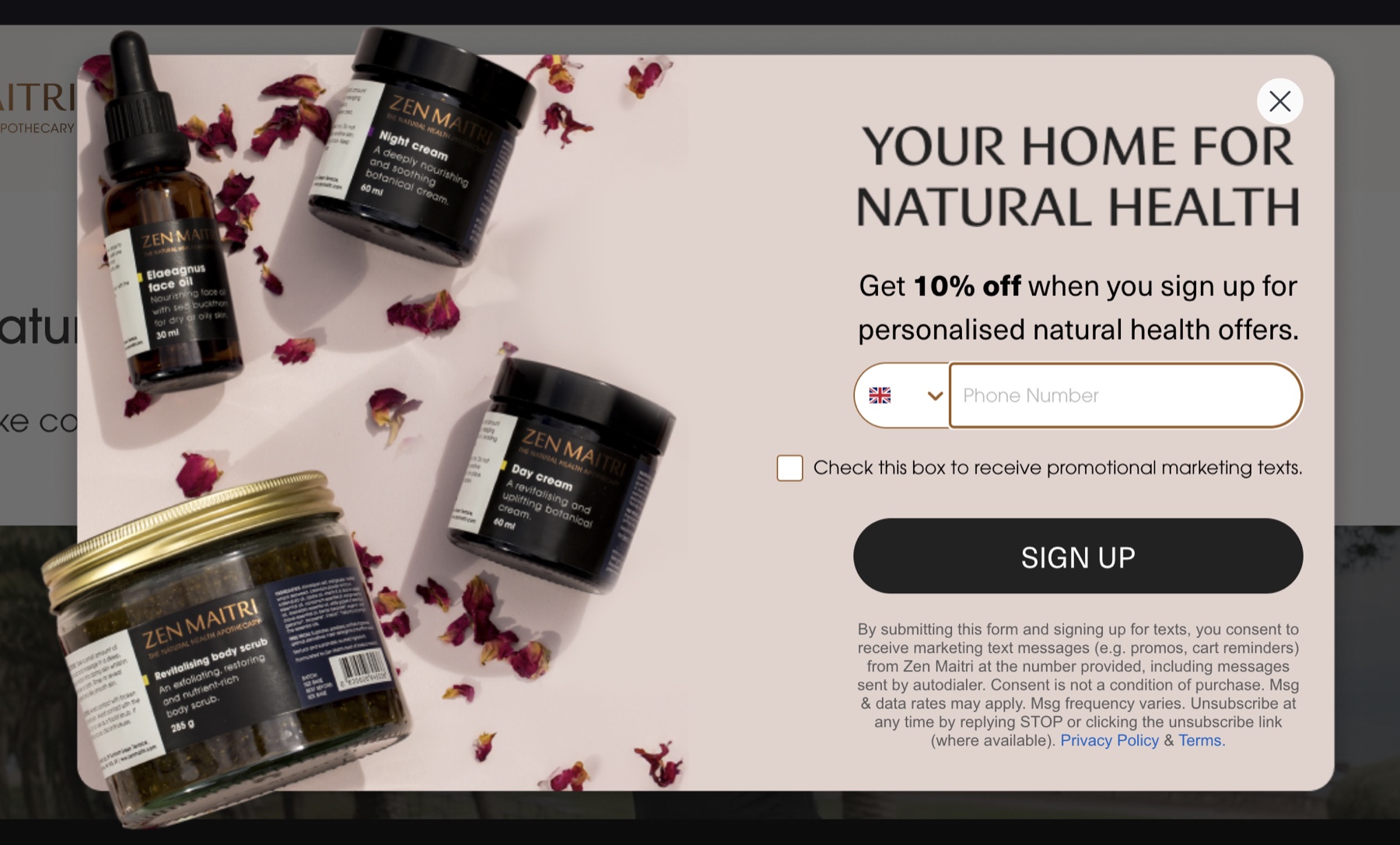

Everybody redesigns the form. Almost nobody changes the rules underneath it, and the rules are where the money is. This is what we look at when a sign-up form isn't doing its job, in the order we look at it.
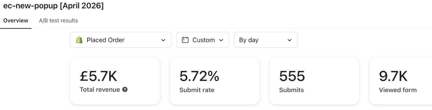
A pop-up is a targeting decision before it's a design
Let's face it: a pop-up has two jobs that pull against each other. Interrupt somebody who's busy, and be worth the interruption. Design decides how that feels. Targeting decides who has to feel it at all.
So the first thing we change on a form that isn't working is almost never the artwork. It's the audience, the moment, and what turns up in the inbox afterwards.
Targeting rules decide more than the offer does
Klaviyo will happily show one form to everybody, on every page, for as long as you leave it alone. That default is why a customer who subscribed two years ago gets asked again on the checkout page.
- Exclude people who are already on the list, so subscribers aren't asked twice
- Exclude the checkout and the account pages, where an interruption costs you an order, not an address
- Split the desktop and the mobile form, because Klaviyo treats them as separate forms anyway
- Point one form at the collection your paid traffic lands on, with copy that matches the advert
- Set a reappearance rule that respects a dismissal for longer than one page view
None of that is design work and all of it moves the number. It's also the half of the job an agency can do in an afternoon, so we do it before anybody opens the editor.
When the form fires, and why exit intent is oversold
The trigger is one setting and it changes the outcome more than the headline does. Fire too early and you interrupt a page that hasn't finished loading. Fire too late and your visitor has already gone.
| Trigger | What it suits | Where it fails |
|---|---|---|
| A timed delay | Most stores, most of the time | Set too short, it lands before the page has drawn |
| Scroll depth | Long collection pages and articles | Never fires on a short landing page |
| Exit intent | Desktop browsers, where there's a mouse | There's no exit intent on a phone |
| A click on a link | A footer sign-up or an offer banner | Only reaches people who went looking for it |
Exit intent is the one we argue about most. On the accounts we run, phones are the majority of sessions, and a form triggered on exit alone simply doesn't appear for them.
Build the mobile form separately, and expect it to behave differently
Klaviyo gives you a mobile version and most brands treat it as the desktop one, squashed. Wrong instinct. On a phone the form owns the whole screen, the keyboard eats half of it, and a close button nobody can find buys you a bounce instead of a subscriber.
So we build the two separately and judge them separately. The phone version tends to be shorter, with the offer in the first line and one field above the fold, and it usually earns its keep.
Every field costs you something
The number of fields is the plainest lever in the whole form. Each one loses you people who'd otherwise have subscribed, so a field has to earn its place by changing what you send.
- An email address, which is the only field that isn't optional
- A first name, worth having if a flow uses it and dead weight if it doesn't
- A birthday, which earns its place only when there's a birthday email to send
- A phone number, on its own tick box, because consent for a text isn't consent for an email
- A preference question, if the answer actually routes somebody somewhere different
A two-step form is the compromise we usually land on. The address goes in on step one and gets captured the moment it's submitted, so asking for a number on step two costs you nothing when it's refused.
Half of a pop-up's job happens after the form closes
The commonest broken thing we find isn't the form. It's the gap between what the form promised and what arrives: a code that doesn't exist, an email slow enough to lose the visitor, or a welcome that never mentions the offer at all.
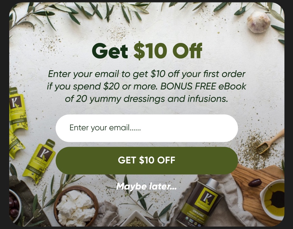
So test the path, not the form. Submit a real address, take the code, try to spend it, and time how long it took. If the offer arrives late or arrives wrong, the fault is in the welcome flow, and the form is getting blamed for it.
Theo Tziapouras
Founder and strategy at Engage Commerce, the ecommerce agency for 7 and 8 figure DTC brands.
FAQs
How often should a Klaviyo pop-up show to the same person?
Once per visit is plenty, and a dismissal should hold for days, not for one page view. Klaviyo lets you set that per form, and the default is more aggressive than most brands realise. People who've already subscribed should be excluded entirely instead of shown the form again.
Does a pop-up hurt the shopping experience on mobile?
It can, and that's a design problem, not a reason to skip it. A form that covers the content, hides its own close button and fires before the page has drawn is a bad experience by any measure. One that arrives after somebody has read something and closes on a single tap isn't.
Should the offer be a discount?
Only if the margin survives it and your welcome sequence can actually send it. Free delivery, early access and a genuinely useful guide all work, and they don't train people to wait for a code before they buy. Pick the one you're happy to give every new subscriber for the next year.
What is a good submit rate for a sign-up form?
We won't publish a benchmark, because a borrowed average tells you nothing about your traffic, your offer or your seasonality. Compare the form against the same form last quarter, and against the version it replaced. Your own history is the only fair comparison you have.
Can one form serve desktop and mobile?
It can, and it usually underperforms both. The screens behave differently, the keyboard changes the layout, and the triggers that work on a desktop browser don't exist on a phone. Two forms is a morning's work, and it's the version we build.
The cheapest thing on the site to fix
A sign-up form is a week of somebody's attention at most, and it feeds every email you'll ever send. Brands spend months on a homepage redesign and leave a sitewide pop-up on its factory settings for two years. If you change one thing this month, change who the form is shown to, then go and read what we do inside Klaviyo if the rest of it looks like a job.
Klaviyo mechanics
The settings that quietly decide what your flows do, from someone who has rebuilt a flow stack.

Building a Klaviyo back in stock flow that does not annoy people
The alert that sells the restock, and the settings that stop it firing at somebody who bought the thing last week.
Read it
The Klaviyo sunset flow: cleaning a list without losing revenue
The flow that stops you sending to people who stopped reading, and the rules that decide who it takes.
Read it
The Klaviyo attribution window, and what it is actually counting
What the window credits, where it is set, why Klaviyo and Shopify never agree, and what an honest report has to say out loud.
Read itWould you rather this was just handled?
Bring your Klaviyo account and the thing annoying you most. We will tell you what we would fix first, before you spend anything.

Half an hour with Theo, our founder.
We're all about relationships built on trust, mutual respect and a shared vision for success. If that sounds like your vibe, let's make some waves together 🌊