The founder note email, and when plain text beats the designed send

A note from the person whose name is on the business earns attention no template can buy, then loses it the moment it looks designed.
This is the one campaign where less production persuades more. It works because it reads like a message instead of a broadcast. So everything that makes it look like marketing takes something away from it, and the header image takes the most.
The design is what stops it working
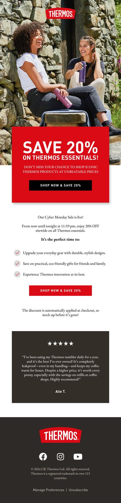
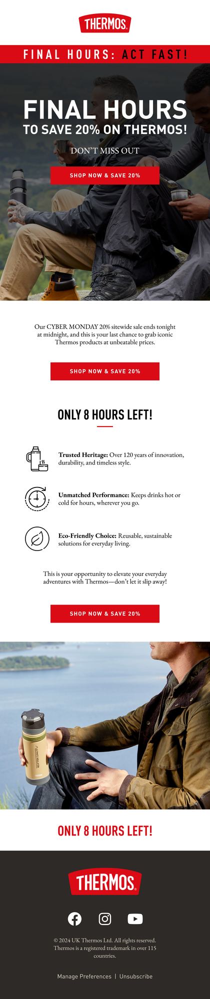
A founder note in a branded template is a press release with a signature at the bottom. The header image, the three column footer and the shop now button all announce that this went to everybody, and the intimacy the format runs on is gone before the first line.
Send the same words as plain text from a real address and they land completely differently. It looks like an email a person sent. It renders the same in every client. And it gets replies, which no designed campaign does.
Four moments that justify one
This isn't a monthly slot. Hold it back for the moments where your reader would reasonably expect to hear from a person instead of from a brand.
- Something went wrong: a delay, a fault, a shortage, an order everybody is waiting for
- Something changed: a price, a formulation, a supplier, a policy customers relied on
- A decision was made that costs the business money and needs explaining, such as not running a sale
- A genuine milestone, told as what it took and not as a celebration
Anything outside those four is a normal campaign wearing a founder's name. Use it for announcements that could have come from anybody and the format wears out fast.
One subject, no marketing furniture
Open with the thing itself. No greeting paragraph, no hope you're well, no recap of the season. Your first sentence is the sentence you'd say if you rang the customer up, and the whole email should be over inside four short paragraphs.
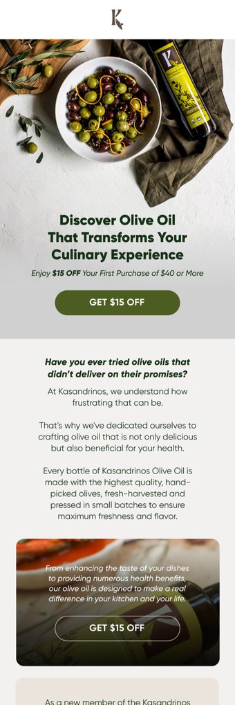
That send is the designed cousin of a founder note, and it shows the trade clearly. The photography carries the story beautifully in a welcome sequence. For an apology or an explanation, those same words with no photograph at all would have hit harder.
Sign it with a real name and send it from an address that takes replies. If you aren't prepared to read the replies, you aren't ready to send this one.
The hardest version, and the one that pays most
When something has gone wrong the note has a fixed shape, and any wandering off it reads as evasion. What happened. Why it happened. What it means for the person reading. What you're doing about it, and what they should do now.
| Do | Do not |
|---|---|
| Name the problem in the subject line | Use a neutral subject that hides it |
| Say what caused it, plainly | Blame a supplier, a courier or the weather |
| Give the date things return to normal | Say soon, or shortly |
| Offer the remedy before it is asked for | Attach a discount code and hope |
Brands keep underestimating how well this performs. A clear apology is often the highest reply rate email of the year, and the replies are overwhelmingly people saying thank you for telling us.
Two or three a year, and never on a schedule
The minute a founder note turns up in the content calendar as a recurring slot, it stops being a note. Subscribers can tell the difference between a message that had to be sent and one that filled a gap, and the second kind spends the credibility the first kind built.
The one place a founder voice belongs permanently is the welcome sequence. A single plain text note early in the welcome flow consistently outperforms the designed emails around it, and it sets up every campaign that follows.
Send yourself the last one you wrote
Open the last founder note you sent and read it on a phone with images off. Still reads like a message from a person? The format is intact. If it collapses into a header and a button, the design was carrying it and the words weren't.
Then check the reply address. In a surprising number of accounts the most personal email of the year goes out from a no reply address, which undoes the whole exercise. It's the first thing we look at in an account.
Write it like the email you would actually send
Keep the founder note rare, keep it plain and keep it honest. Send it when something has gone wrong, when something has changed, or when a decision needs explaining, and let it look like exactly what it is. The brands that get the most out of this format are the ones that read every reply, because the replies are the real return on it.
FAQs

Should a founder note really have no images at all?
Usually none, or one photograph a person would genuinely have attached to a real message. That's the test. A header banner and a footer full of category links fail it immediately.
Who should a founder note come from if the founder has left?
Whoever now makes the decision you're explaining. The format runs on the reader believing the person writing can actually change what's being discussed, so a managing director or an operations lead works. A marketing team doesn't.
Will a plain text email hurt deliverability or tracking?
It usually helps deliverability, because it looks like ordinary correspondence instead of a bulk template. You do lose open tracking if you strip the pixel. Small price, and worth paying for the format to work as intended.
How long should a founder note be?
Four short paragraphs is a good ceiling. If it needs more, the thing you're explaining belongs on a page you link to, with the note saying what happened and where to read the detail.
Show the people behind it
Founders, the team and the decisions nobody outside the business ever gets to see.

The founder q and a email, answered in the founder's own words
Ask your list what they want to know and you get two campaigns: the questions themselves, and the answers a fortnight later.
See the campaign
The behind the scenes email that earns its place in a busy inbox
Nobody wants a tour of your warehouse. They want to know why the thing takes three weeks, and what happens in those three weeks.
See the campaign
The meet the team email that makes the next support ticket easier
Organised by job title it is an org chart. Organised by what a customer might need, it is the most useful email in the sequence.
See the campaignRather we planned the campaigns for you?
Bring your Klaviyo account and next quarter's calendar. We'll tell you which of these sends your list is missing, and which one we'd run first.


Half an hour with Theo, our founder.
We're all about relationships built on trust, mutual respect and a shared vision for success. If that sounds like your vibe, let's make some waves together 🌊