Visual hierarchy: what your reader sees first, second and not at all
The order someone's eye takes your email in. Get it right and they know what you want in a glance. Get it wrong and everything shouts at once.
- 149Visual Hierarchy
- The arrangement of elements in an email to guide the reader's attention, enhancing readability and engagement.

- Built with
- Size, contrast, colour, space and position on the screen
- Usual order
- Headline, image, one supporting line, the button, then the rest
- Quick test
- Squint at it: whatever still stands out is your hierarchy
Decide the reading order before anyone opens a design tool
Hierarchy isn't a design flourish. It's a decision about what matters, made before the design starts. Write down the one thing someone should take from the email, then the order they should meet everything else in.
- The headline: what this email is about, in a few words
- The image that shows it
- One supporting line with the reason to care
- The button, your call to action
- Everything else, smaller and further down
If two things are fighting for the top slot, one of them belongs in another email.
Size, contrast, space and position, and how each gets overused
| Tool | Use it on | Overused, it looks like |
|---|---|---|
| Size | The one headline | Three headlines all the same size |
| Colour and contrast | The button | Every link in the same loud brand colour |
| Space | Separating the main ask from the rest | Everything crammed in to fit one more product |
| Position | What a phone shows before any scrolling | A tall logo where the offer should be |
Every row works the same way. Each tool makes one thing different from everything around it. Use it on everything and it stops working.
Hierarchy on a phone, where two columns become one
On a phone, a two-column layout usually stacks into a single column, so whatever sat beside the headline lands underneath it. The order you designed on a laptop isn't always the order a phone reader gets. Read the test send on a phone, top to bottom.
Your store has the same problem. A product page has its own order: the product, the price, the size or colour choice, the add to basket button, then reviews and details. When that order breaks, it's a conversion rate optimisation problem, not a copy one.
The squint test for an email where everything shouts
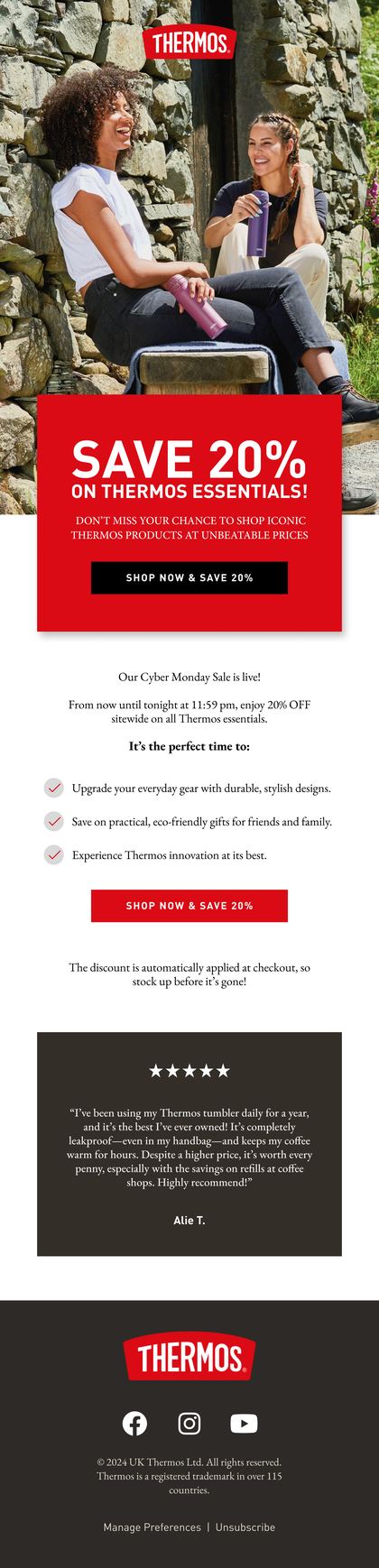
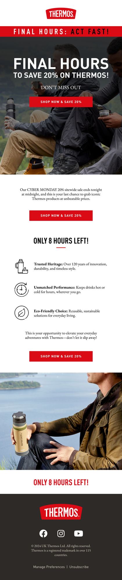
Agencies love an email where every block is the most important block. Readers don't. A sale email with five offers in bold red reads as noise, because if everything's urgent, nothing is.
So squint at it, or blur a screenshot. Whatever still stands out is your real hierarchy. If that's the headline and the button, good. If it's a badge in the corner, start again.
Related terms
FAQs

How can I tell if an email has a clear visual hierarchy?
Show it to someone on a phone for a few seconds, then take it away. Ask what it was about and what they were meant to do. If they can't answer both, the hierarchy failed, however good it looks. The squint test does the same job when nobody's around to ask.
Should every email start with a big hero image?
No. A hero earns the top of the email when it carries the message: the product, the offer, the new range. A big lifestyle shot that says nothing just pushes the headline and button down the screen. Sometimes a headline in live text at the top does more.
Does visual hierarchy apply to pop-up forms too?
Yes, and they're a good place to practise. A pop-up has one job, so its order should be obvious: the offer, the field, the button, then the small print. If the close button or the legal text is the loudest thing on it, the form's working against you.
Rather we explained it on your own account?
Bring your Klaviyo account to a growth consultation. We'll walk through what this means for your numbers, in plain English, and what we'd fix first.


Half an hour with Theo, our founder.
We're all about relationships built on trust, mutual respect and a shared vision for success. If that sounds like your vibe, let's make some waves together 🌊