Good user experience means customers never have to ask
How easy your shop, your checkout and your emails are to use, from the first tap to the parcel arriving. Nobody notices good UX. They just buy again.
- 145UX (User Experience)
- The overall experience a user has when interacting with an email, website or application, focusing on ease of use, accessibility, and satisfaction.

- Covers
- The site, the checkout, your emails, delivery updates and returns
- Not the same as
- UI, which is how the screens look
- Cheapest test
- Watch someone buy from your shop on their own phone
- Free research
- The questions sitting in your customer service inbox
UX runs from the first tap to the parcel on the doorstep
Most people hear UX and think of the website. Your customer doesn't draw that line. The order confirmation, the delivery updates, the returns page and the email a week later are all part of using your shop, and any of them can be the bit that goes wrong.
So UX is a retention problem as much as a conversion one. A clumsy checkout costs you the first order. A delivery nobody explained costs you the second.
Your customer service inbox is a free UX report
Every question a customer has to email you about is a gap in the experience. Sort a month of them by topic and you've got a list of fixes, already ranked by how often they bite. Pair it with a heatmap of the pages they're asking about.
| What customers keep asking | Where the answer should already be |
|---|---|
| Where's my order? | A shipping confirmation email with tracking that works |
| Will it fit? | A size guide on the product page, and in the abandoned cart email |
| How do returns work? | The cart, the checkout and the post purchase emails |
| When is it back? | A back in stock sign-up on the sold out page |
Your emails have a user experience as well
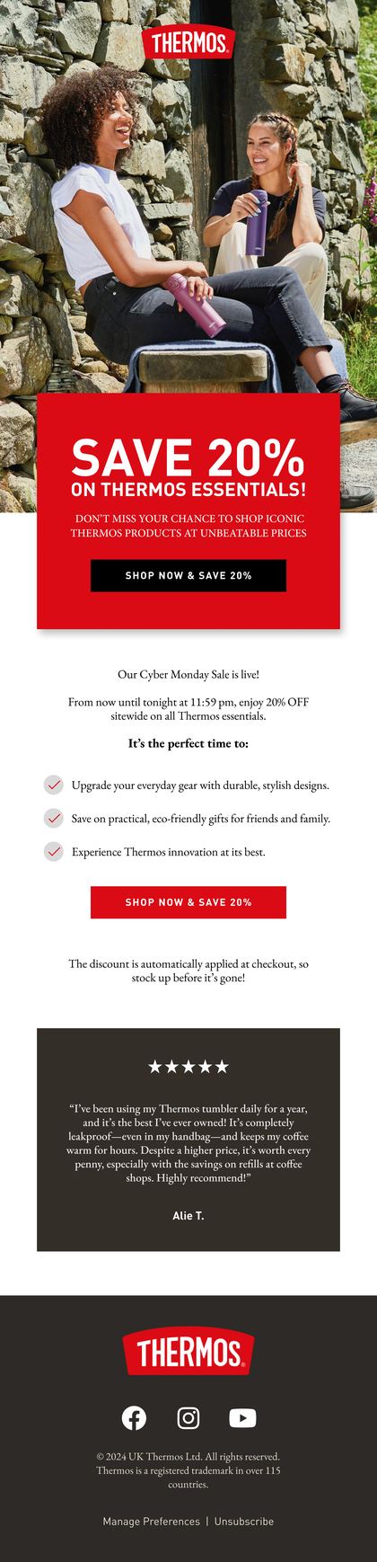
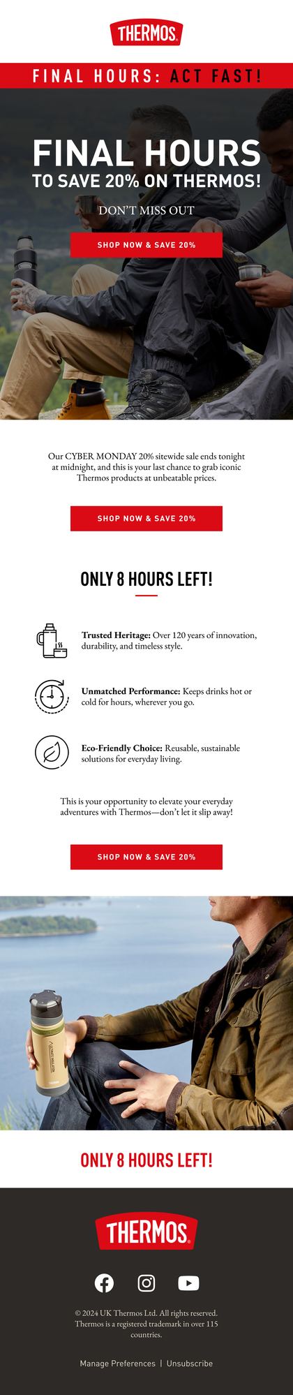
Assume every email gets read on a phone, maybe in dark mode, by someone with one thumb and not much patience. Buttons big enough to tap. Text that isn't baked into an image. Alt text for when the images don't load.
And an unsubscribe link that's easy to find. Odd advice from people who do retention for a living? Not really. Someone who can't find the link presses spam instead, and that hurts every email you send after it.
Then run the check that catches most of this. Buy something from your own shop, on your own phone, as a guest, and read every email that follows. Anything that makes you frown goes on the fix list.
Related terms
FAQs

What's the difference between UX and UI?
UI is the screens: the layout, the buttons, the type and the colours. UX is whether using them works, from finding the product to getting the parcel. A beautiful interface can still be a bad experience if the delivery date's hidden or the size guide's missing.
How do you measure user experience on an online shop?
No single number does it. Watch conversion by device, exits on your key pages, the reasons in your returns data and the topics in your customer service inbox. When those move the right way together, the experience got better. When only one moves, look harder before you celebrate.
Who should own UX in a small ecommerce team?
Whoever can see the whole trip, which usually means the founder or whoever runs the site and the emails together. Split ownership is how a shop ends up with a lovely website and a confusing delivery email. Give one person the job of buying from the shop every month, as a stranger.
Rather we explained it on your own account?
Bring your Klaviyo account to a growth consultation. We'll walk through what this means for your numbers, in plain English, and what we'd fix first.


Half an hour with Theo, our founder.
We're all about relationships built on trust, mutual respect and a shared vision for success. If that sounds like your vibe, let's make some waves together 🌊