Text to image ratio: there's no magic number, but there is a rule
How much of your email is real text against pictures. People quote a tidy ratio for it. The real rule is simpler: never send an email that's one big image.
- 131Text-to-Image Ratio
- The proportion of text to images in an email, affecting deliverability and load times.
- Judged
- By eye, as live text against pictures, not by a formula
- Real risk
- An email built as one image: blank with images off, silent to screen readers
- The fix
- Headlines, offers, prices and buttons built as live text
Where the ratio rule came from, and why nobody can give you a number
Spammers used to put their whole message inside a picture so filters couldn't read the words. Filters got suspicious of emails that were nothing but images, and somewhere along the way that turned into a neat ratio people repeat to each other.
Here's the thing: the big mailbox providers don't publish one. Google's sender guidelines cover authentication, complaints and unsubscribing, and say nothing about how many pictures you use. Anyone quoting you an exact split is passing on a rule of thumb.
What the one-picture email costs you
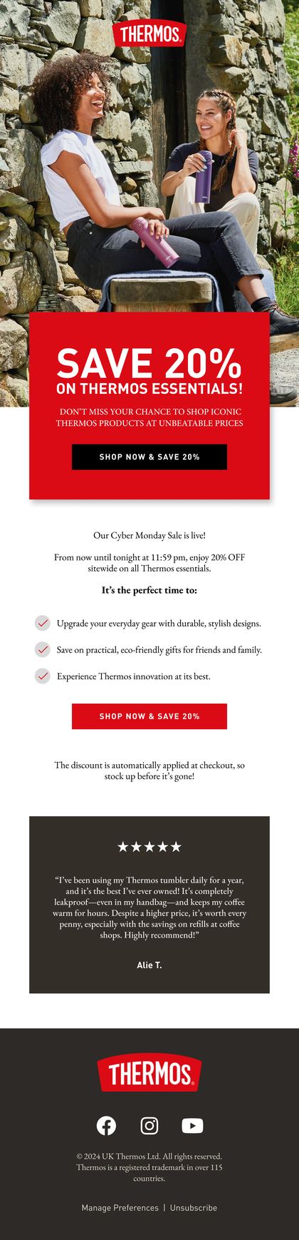
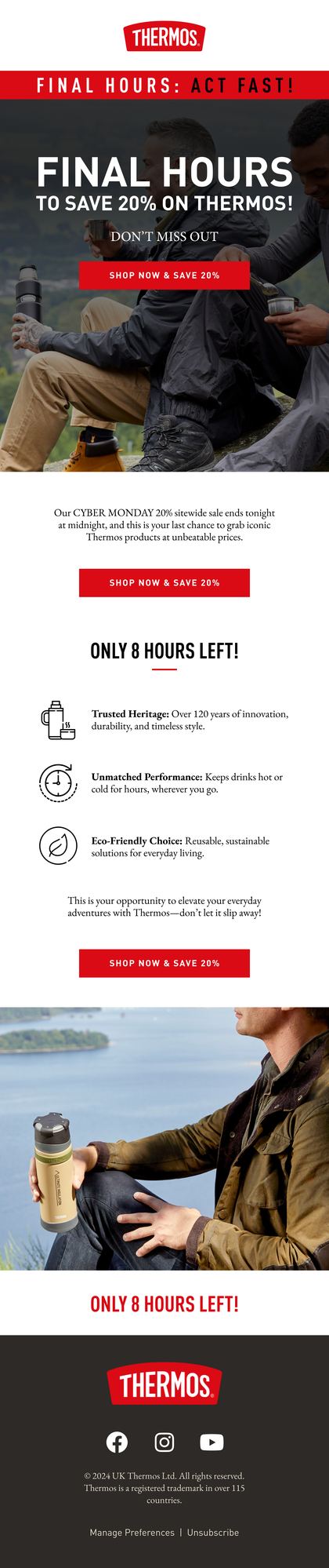
The real culprit is the email designed in a design tool and exported as one tall picture. It looks perfect in the preview. Then it lands.
- Some inboxes, Outlook among them, hold images back, so it arrives blank
- A screen reader gets one line of alt text, or nothing at all
- Mobile data shows an empty box while the whole thing loads
- One picture usually means one link, so your click report can't tell you what people wanted
Build it so the message survives with the pictures off
| Part of the email | Build it as |
|---|---|
| Headline and offer | Live text |
| Prices and deadlines | Live text |
| Buttons | Live text in an HTML button |
| Product and lifestyle photos | Images, each with alt text |
| Your logo | An image, with your shop's name as its alt text |
Then check it. Send yourself a test, switch images off and read what's left. If you can still tell what's on offer and where to click, your balance is fine, whatever the ratio says. Write the alt text for the pictures while you're there.
Related terms
FAQs
What is a good text to image ratio for email?
There isn't an official one. Mailbox providers don't publish a number, so the ratios you'll see quoted are rules of thumb. Aim for an email whose message still makes sense with the images switched off: real text for the words, pictures for the photography, and never one single image.
Can an image-heavy email still land in the inbox?
Yes, if your sender reputation's healthy and people engage with what you send. Reputation counts for more than layout. An email built from one big image just makes life harder: it's blank for anyone with images off and gives a filter nothing to read but a link.
Are plain text emails better for deliverability?
Not automatically. A plain, letter-style email from the founder can do well because it reads like a person wrote it, and some people reply. That's engagement at work, not a format rule. Use it when the message suits it, and keep sending designed emails when you're showing products.
Rather we explained it on your own account?
Bring your Klaviyo account to a growth consultation. We'll walk through what this means for your numbers, in plain English, and what we'd fix first.


Half an hour with Theo, our founder.
We're all about relationships built on trust, mutual respect and a shared vision for success. If that sounds like your vibe, let's make some waves together 🌊