Exit intent popups are annoying because they fire on the wrong page
One trigger, five different moments. The page decides what a popup should say, and a site-wide discount teaches repeat visitors to close it on reflex.


Fire the same discount at a first-time browser and a three-time cart abandoner and you convert neither. You just teach your best customers to click past you. The trigger is one mouse movement. The response should be a fresh decision, made off the page the person is standing on.

One popup firing everywhere teaches people to close it unread
Someone lands from a Google search, hasn't scrolled past the fold, and their cursor drifts up towards the tab bar. In slides a popup offering a first order discount. On another tab, someone who's read four of your guides this week and has two items in the basket makes exactly the same mouse movement. Same popup.
That's not personalisation, that's a tripwire set off by a mouse movement. It doesn't know who tripped it or where they were standing when they did. Most tools ship this way by default: one popup, firing anywhere on the site.
You install it, watch a small bump in captures in the first week, then watch the close rate creep as returning visitors start dismissing it on reflex. The tool isn't broken. The targeting's lazy, and it's lazy on the one variable that decides everything, which is the page.
Sort every page into a handful of types before touching the tool
Look, the trigger is the same everywhere. What the person needs from you at that moment isn't. Someone leaving a product page has a different relationship with your brand than someone leaving a guide, a filtered collection or a homepage they reached ten seconds ago. So keep the trigger and change the response by URL.
Before you write a line of new popup copy, group every page on the site into types. The pages people abandon are usually the pages with no capture point on them, and your session recordings will show you which ones matter. This is the part that takes real effort.
- Homepage and landing pages: no product context yet, so it's the one place a broad welcome offer still makes sense
- Collection pages: a category in mind, no product chosen, so speak to the category and not to one item
- Product pages: the product is sitting there in the URL, so the popup has no excuse not to name it
- Blog and guide pages: they came for information, not a transaction
- Cart and checkout: a different kind of abandonment, closer to a rescue than a first offer
Once the map exists, the build is just assigning a response to each row. No more agonising over one universal message that has to work everywhere. Most of the effort turns out to be the sorting, and the copy for each version follows quickly once the map is settled.
A reader leaving a guide doesn't want a discount code
The tool defaults to capturing an email with a discount, and nobody questions it on a content page. But somebody reading a guide came to learn something. A first order offer tells them you weren't listening.
What they will take is more of what they came for. Offer the extended version of the same guide, or a closely related one, in exchange for their email, with no discount anywhere near it. You still get the address. And you've tagged the subscriber by what they read, not as somebody who once saw a popup.
That tag decides what happens next. It's the difference between dropping an engaged reader into the generic welcome series, discount email first, and sending a follow-up that carries on the topic they were reading. Capture is half the job. The flow behind it has to read off the same map.
A popup on a product page should name the product
Someone on a product URL has already told you what they're interested in, just by being there. A blanket site-wide code ignores every bit of that. Pull the product name, and the image where it helps, straight off the page the popup fires on, so the offer visibly references the thing they were looking at.
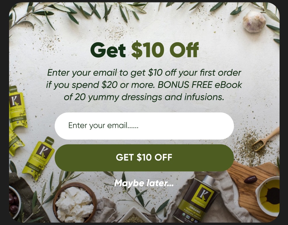
A full screen offer like the one above earns its place on a homepage, where there's no product context to work with yet. Fired over a product page, the same asset interrupts a decision already in progress. Same popup, different page, opposite result.
Split it by stock level and it sharpens again. A low or out of stock item wants a capture that promises news when it's back, which builds a smaller, hotter list than any coupon. That's conversion work at heart, and the email programme inherits everything it captures.
Leaving the cart is a rescue moment, not a first offer
Someone heading for the tab bar with items in the basket isn't a fresh exit intent case. It's cart abandonment starting. Hand it to the sequence built for that job, because a second code stacked on whatever got the item into the basket just cuts the margin twice.
The popup's job on a cart page is small. Hold the basket, capture the address if you haven't got it, then get out of the way. The recovery argument belongs in the emails that follow, where there's room to make it properly.
How you build and trigger the forms is a separate question, and our pop-up best practices guide covers it in full. Where each form fires is the decision the page map settles, and it's the part most installs skip.
One shared map beats two teams guessing separately
This works because whoever builds the popups and whoever writes the flows are deciding off the same document instead of guessing at each other. Let a blog popup start tagging subscribers by topic without telling the flow owner, and better capture gets spent on a mismatched follow-up. The popup asked a specific question. The email answered a generic one.
Swap one flat popup for a handful of page-aware ones and capture tends to move without the offer changing at all. The ask finally matches the context. The lift only survives past the first email when the flows keep each popup's promise. That coordination, not the trigger, is usually what went wrong when exit intent didn't seem to work.
One honest caveat, because we won't pretend this suits every shop. Genuinely low traffic won't give any single page type the volume to justify several variants, so get the traffic up first. The page-aware version suits a site with enough people leaving to measure the difference, and you can see where it sits inside a full programme across the client work.
Theo Tziapouras
Founder and strategy at Engage Commerce, the ecommerce agency for 7 and 8 figure DTC brands.
FAQs
Should I show an exit popup on blog posts?
Show one, but drop the discount. A reader on a guide is in research mode, so offer the extended version of that guide or a closely related one in exchange for an email address. Then tag the subscriber by topic, so the follow-up carries on the conversation instead of opening with an offer they never asked for.
What should an exit popup say on a product page?
Name the product. They've already told you what they're interested in by being on that URL, so a generic site-wide offer just reads as noise. Reference the item. And if it's low on stock or out of stock, swap the discount for a back in stock capture, which pulls in far more committed subscribers.
Do exit popups work on mobile?
There's no cursor on a phone, so true exit intent doesn't exist there. Mobile tools approximate it with a fast scroll back towards the top, a press of the back button or time on page. The page map matters even more on mobile, where a mistimed full screen popup is harder to get rid of.
The popup isn't the product. The map is
Anyone can switch on exit intent in an afternoon, which is exactly why one more site-wide discount earns nothing. The work that pays is the unglamorous sorting of pages into types, and the agreement about what each one asks for. Do that once and every capture tool you add afterwards inherits the intelligence. The popup was never the decision.
Programme and calendar
How often to send, what to send when, and what retention costs to run.
Your subscription cancel flow is where the most recoverable revenue is leaking
The moment somebody clicks cancel is the one retention moment most brands skip, and the easiest one to rebuild.
Read it
The July sale nobody needed, and the alternatives to discounting that beat it
A discount solves the dashboard problem for one month, then spends the rest of the year training your list to wait for the next one.
Read it
Your ecommerce thank you page is the best segmentation moment you're ignoring
The seconds after order confirmation are the highest attention a brand ever gets, and most stores spend them on a receipt.
Read itWould you rather this was just handled?
Bring your Klaviyo account and the thing annoying you most. We will tell you what we would fix first, before you spend anything.

Half an hour with Theo, our founder.
We're all about relationships built on trust, mutual respect and a shared vision for success. If that sounds like your vibe, let's make some waves together 🌊