Reading a Klaviyo revenue report without fooling yourself
The number on the front is a claim with a window attached. And the window is a setting somebody chose.


Attributed revenue is the number every email agency puts on the first slide. Us included. It's a real measurement of a real thing, and it isn't the same thing as money you wouldn't otherwise have made. The gap between those two is where the arguments live.
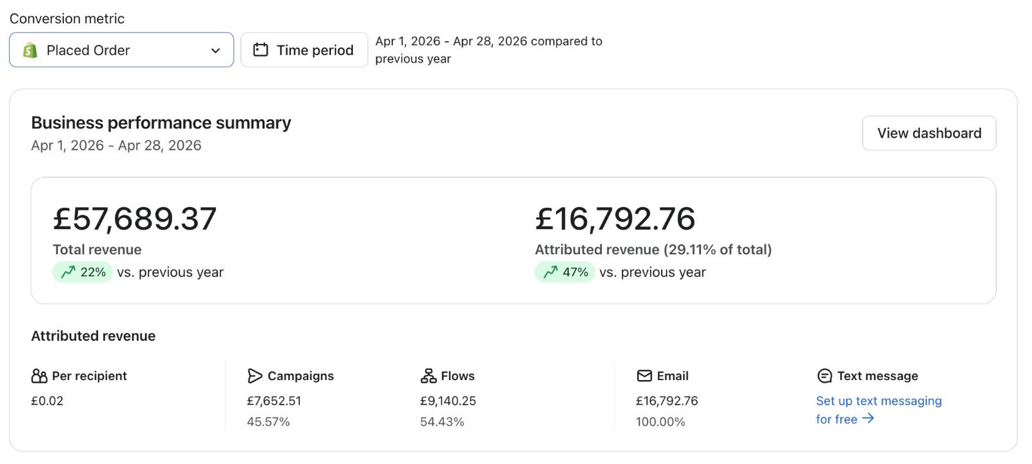
Attributed revenue is a claim with a window on it
So, that big number on the front page. Klaviyo credits an order to a message when the order lands inside a set period after somebody opened or clicked it. That period is the attribution window. It's an account setting, and the person who set it may not work there any more.
The report isn't lying to you. It's answering a narrower question than the one you asked: how much did people buy shortly after touching an email.
It can't see most of what happens away from it either. Somebody reads the email on a phone at lunch and buys on a laptop that evening, and whether that order gets credited depends on whether the platform can join the two up. Klaviyo does that better than most tools. It still misses some.
Two numbers of different kinds, sitting side by side
Total revenue is the shop. Attributed revenue is email's claim on part of it. Read them as two competing totals and you've made the commonest mistake we see in a board pack.
The conversion metric changes the answer
There's a conversion metric dropdown at the top of the report, and almost nobody touches it. Switch it and every figure underneath moves. You've changed what counts as a conversion.
- Placed Order counts the order, which is what a finance team means by revenue
- Ordered Product counts the line items, which is a different and larger number
- The date range compares against the previous period or the previous year, and seasonal businesses look very different in each
- The attribution window decides how long after a click an order still counts
- SMS and push have their own windows, so a mixed programme isn't one comparable number
Pick a setting, write down why, then leave it alone. Switching the conversion metric halfway through a year is moving the goalposts, and it quietly invalidates every chart you produced before the day you did it.
The one chart that argues with itself
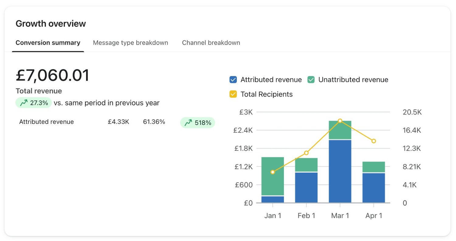
This is the view worth living in. The bars split what email can claim from what it can't, month by month, and the line over the top is how many people you sent to.
Read those two together and the flattering months stop flattering. A month where the attributed bar grew because the recipients line grew is a month you bought, not a month you earned. It's the pattern behind most agency growth charts.
Two agencies, two windows, two different truths
Two agencies quoting wildly different numbers for the same account? Usually not dishonesty. Nobody agreed the settings before the comparison, and every one of those settings moves the answer.
| What you're shown | What to ask | Why it matters |
|---|---|---|
| Attributed revenue | Over what window, and from a click or an open? | A long window and open attribution always report a bigger number |
| The conversion metric | Placed Order or Ordered Product? | One counts orders, the other counts items, and they never match |
| The comparison period | Against last month or the same month last year? | A seasonal business can post growth in a flat quarter |
| Flows against campaigns | Which side of the split moved? | Flow revenue compounds, campaign revenue is spent when it's sent |
Put those four to your own team as well. Most in-house reports we get shown have never had them put to them. That's how a business comes to believe email grew in a quarter when the list just got bigger.
The order we go through it in
- Check the conversion metric and the window before reading a single figure
- Read attributed revenue as a share of total revenue, not as a total of its own
- Look at revenue per recipient, which is the number that falls when you're simply sending more
- Split flows from campaigns, because they are two different businesses in one report
- Compare against the same quarter last year, and against nobody else's benchmark
None of that makes the number incremental. It makes it comparable, and that's the most any platform report can honestly give you. It's enough to run a programme on.
If somebody else prepared the report, the questions in that table are the ones to ask out loud. Choosing an agency covers what a straight answer sounds like, and the Shadow Foam write-up shows the shape of a report we're happy to publish.
Theo Tziapouras
Founder and strategy at Engage Commerce, the ecommerce agency for 7 and 8 figure DTC brands.
FAQs

What does attributed revenue mean in Klaviyo?
It's the revenue from orders placed within a set period after somebody opened or clicked one of your messages. That period is the attribution window, and it's configured in the account. It measures orders that followed an email. Not orders that email caused.
Why does Klaviyo show more revenue than Shopify or Google Analytics?
Because the three of them count differently. Klaviyo credits an order to the message somebody touched before buying, Shopify records the order itself, and Analytics credits the last click before checkout. None of them is wrong. They answer different questions, and you should never add them together.
What is a good email attribution percentage?
There's no number worth quoting, and any agency handing you one is quoting somebody else's account. What matters is the direction of your own share across several quarters, and whether revenue per recipient holds while you grow the list.
Can I trust the flow revenue figure?
As much as any of it, with one caveat. A flow gets credited with orders placed after somebody opened or clicked one of its emails, so a welcome series always looks strong: it reaches people at the moment they were most likely to buy anyway. Read it against revenue per recipient, not against its own total.
Should I change the Klaviyo attribution window?
Only with a reason, and a note of the date. Shortening it makes email look smaller and more honest, lengthening it does the opposite, and either change breaks the comparison with everything you reported before. Pick one, write down why, and leave it alone.
A report you can argue with beats one you cannot
We publish attributed revenue with the window, the period and the store's own totals next to it, because a figure with no context is a marketing claim wearing a chart. Ask for the same from anybody reporting on your account. The agencies worth hiring hand it over without being asked twice. Takes them about a minute.
Measurement and attribution
Which numbers are worth watching, and which ones flatter everybody who reports them.

Ecommerce email marketing benchmarks UK brands quote, and what to use instead
Published averages describe accounts you can't see. The comparison that works is your own last period, same segments, same season.
Read it
Revenue per recipient is the number worth watching
Total revenue rewards sending to everybody. Open rate stopped meaning much in 2021. Per recipient is the one that survives both.
Read it
Is email revenue incremental, or would those people have bought anyway
Attributed revenue is a credit system, not proof of cause. The difference is measurable, and most brands have never measured it.
Read itWould you rather this was just handled?
Bring your Klaviyo account and the thing annoying you most. We will tell you what we would fix first, before you spend anything.

Half an hour with Theo, our founder.
We're all about relationships built on trust, mutual respect and a shared vision for success. If that sounds like your vibe, let's make some waves together 🌊