Shopify email capture is what turns a website into a list machine
The site takes the first order. The list pays for every order after it, so each template has to earn its place with an ask.


Open a typical Shopify theme and count the ways a stranger can hand over an email address before spending money. On most sites the count is one: a discount popup nobody designed to convert anyone. Brief the project as a list machine with a checkout attached and every template starts earning its place.
Most sites give a stranger one way in, and it's the wrong one
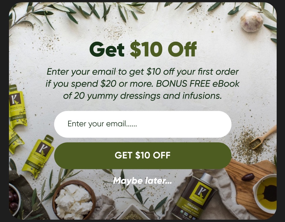
Walk any DTC theme and look for the places a visitor can join the list before they buy. There's usually one. A discount popup that fires before they've read a product description, and gets closed by nearly everybody who sees it. Point it at a blog reader and it does even less, because nobody asked that visitor what they came for.
Nobody on the build team designed that popup to convert anyone, and nobody on the email team asked for it. It's the box that ships with the theme. We've called it list growth for so long that most brands never separate the site that takes the order from the list that makes the second order worth having.
A designed pop-up isn't the enemy. A default one is. When somebody writes the offer for the person actually on the page, times the trigger and builds the form for a phone screen, the same device earns its keep.
A fit quiz has to end at an account, not a discount code
A fit or supplement quiz is the easiest capture point on the whole site to get wrong, because bolting a code onto the results screen feels like finishing it. That's the wrong version: five questions, a result card, a coupon and an email tickbox squeezed in as an afterthought. Most people bail before the end, because there was never a reason to finish beyond a discount the popup would've handed them anyway.
The right version treats the account as the payoff. The results screen offers to save the fit profile, so every recommendation from there on is already sized and shaded for the person reading it. The discount, if there is one, comes after that ask instead of replacing it.
On a properly wired Shopify build the answers go into customer tags or metafields at the point of account creation. Not into a form tool that never speaks to the store again. Those tags are what let flow three send somebody their matched products instead of a generic shop now banner. A quiz that only hands out a code teaches people to wait for the next markdown. One that opens an account gives you a person you can keep talking to for years.
The confirmation page should ask a question, not say thank you
The order confirmation page is the highest attention, lowest friction moment on the whole site, and almost every brand spends it on a static thank you graphic and some confetti. The customer has just paid. They aren't going anywhere. The standard build treats that page as decoration instead of data collection.
Build it around one real question: what nearly stopped you buying today, or what made you choose us over the last place you looked. One field, no dropdown of a dozen options nobody fills in, answerable in a sentence. The individual answer matters less than what the pattern of answers does to the rest of the account.

Somebody who says price was the sticking point gets tagged differently from somebody who wasn't sure about sizing, and those tags feed the email side directly: value led content for the first group, fit reassurance and reviews for the second. A page that keeps naming sizing as the objection is also telling you which product template needs work, without a single split test. A thank you graphic gives you nothing to act on.
Sold out is a capture point, not a dead end
Most themes treat sold out as an apology. A greyed out button, maybe a notify me link buried under the size chart. Nothing about it suggests you care whether that visitor ever comes back. That's the moment you lose a customer you had already half won.

Build a dedicated restock page and treat the waiting list as a queue for early access, not a notification switch nobody trusts. Make the trade explicit: leave your email, hear first when stock lands, sometimes with a small allocation held back for the list. That rewards the wait instead of apologising for it.
The wiring matters as much as the copy. A ticked notify me box usually fires a generic back in stock email days after the fact, once the interesting sizes have gone again. A page connected to an inventory webhook fires the moment stock arrives, to the people who were promised they'd hear first, before the product page goes live to everybody else.
Design the site and the list plan in the same kickoff
None of this works if it's designed after the theme is built. That's a process decision more than a design one. Your Shopify developer and your email strategist sit in the same kickoff, looking at the same page list, before a single wireframe exists. Hand a site over once it's finished and capture ends up wedged in wherever there's spare margin.
That meeting produces one document: the ask on every template, agreed before layout starts. And if a phone number appears anywhere on it, that gets its own opt in, not a shared tickbox.
- Product page: what happens if they don't buy today
- Cart and checkout: what happens if they abandon
- Post purchase: which question replaces the thank you graphic
- Restock and sold out states: what's traded for the wait
- Account area: what personalisation earns the next login
Every row gets a name attached in that meeting, developer or strategist, and gets built into the template before launch instead of patched in later as a popup embed. That's the only thing separating a site that happens to have a list attached from a list machine that happens to sell things. The pattern holds across every case study we publish: the site takes the order, and the email system it feeds pays for the orders after it.
Theo Tziapouras
Founder and strategy at Engage Commerce, the ecommerce agency for 7 and 8 figure DTC brands.
FAQs

Where should email capture live on a Shopify store?
Everywhere a visitor says no or not yet, not just in a popup. The product page needs an answer for people who don't buy today, the sold out state needs a trade for the wait, the confirmation page needs a question, and the account area needs a reason to log back in. The popup is one capture point among many.
Do discount popups still work for email capture?
A designed one does. Write the offer for the visitor who's actually on that page, delay the trigger until they've seen something worth staying for, and build the form for a phone screen first. The default theme popup fails because nobody wrote it for anyone, not because popups stopped working.
How do you capture emails on sold out products?
Replace the disabled button with a dedicated restock page that trades early access for the wait. Wire it to an inventory webhook and a back in stock flow so the promise gets kept the moment stock lands. A generic notify me link that fires days later teaches people that joining your list means nothing.
What should a product quiz collect besides an email address?
The answers themselves, written into customer tags or metafields at the point of account creation. Sizing, shade, goal, whatever shapes the recommendation, because those fields are what let the flows send matched products instead of a generic banner. A quiz that logs answers in a form tool the store can't read has collected nothing.
Call it a website if it makes the invoice easier
The first sale barely covers what it cost to win, and everybody in the kickoff knows it. Brief the project as a list machine with a checkout attached and every template starts earning its keep, one ask at a time. Call it a website build if that makes the invoice easier to write. Just don't build it like one.
Programme and calendar
How often to send, what to send when, and what retention costs to run.
Should you email your entire list? Half my job is saying not today
A full list blast spends your best customers' attention on people who stopped reading months ago, and the bill arrives weeks later.
Read it
Does direct mail work for ecommerce? Only if you run the maths first
A postcard's cost is linear and unforgiving per name, so it only earns its keep on the most valuable slice of a lapsed list.
Read it
How to retain Black Friday customers without training them to wait for the next discount
One discounted order makes a bargain hunter on probation, not a VIP. What you send next decides which one you keep.
Read itWould you rather this was just handled?
Bring your Klaviyo account and the thing annoying you most. We will tell you what we would fix first, before you spend anything.

Half an hour with Theo, our founder.
We're all about relationships built on trust, mutual respect and a shared vision for success. If that sounds like your vibe, let's make some waves together 🌊