The comparison chart email for a range nobody can choose between
When two of your own products look interchangeable, the customer settles it by buying neither. A chart is how you unblock that.
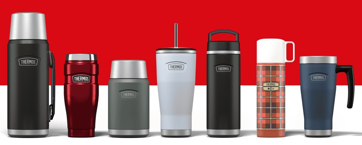

Ranges get built one product at a time. Then you look up and three of them are impossible to tell apart. The comparison chart email settles that in a single screen, and it's one of the very few campaigns that sells on its own with no offer attached.

Choice paralysis is a conversion problem with an email fix
A customer who can't tell two of your products apart doesn't pick the cheaper one. They defer. Deferring means going off to do something else, and it's why category pages with wide ranges convert worse than narrow ones.
The chart takes that decision off the site and puts it in the inbox, where you control the order, the rows and the recommendation. Very few formats sell this directly without a code attached.
It's also the one most often built badly. The instinct is to put everything in.
Three products, four rows, one recommendation
| Include | Leave out |
|---|---|
| The two or three people confuse | The whole range |
| The differences a customer would notice | Specifications you list because you have them |
| A plain recommendation for each type of buyer | A neutral chart with no guidance |
| The reason the expensive one costs more | A price row on its own |
Four rows covers almost every range. If a fifth genuinely changes somebody's decision, drop the weakest of the first four instead of adding to the pile.
The recommendation is the bit brands leave out, on the theory that a neutral table is more honest. It isn't more honest. It's less useful, and the customer is left guessing at exactly the thing you declined to tell them.
A table with three columns doesn't survive a phone
Most of your list is reading on a screen narrower than the table you designed. A three column grid either shrinks below readable or scrolls sideways. Both mean the email failed at the only job it had.
- Stack the products as cards on narrow screens, one after another, each with the same four lines in the same order
- Put the differentiating line first inside each card, not the product name
- Use words instead of ticks, because a tick with no column heading in view means nothing
- Keep the recommendation visible in every card, not once at the bottom
Test it on an actual phone before it sends. This is the campaign where a rendering problem does the most damage, because here the layout is the content.
Sorting by buyer beats sorting by specification
That send never puts a chart in front of anybody. It sorts the range by who is doing the buying, so the same information sits around the reader instead of around your catalogue. It's also far easier to build responsively.
Use the chart when the products are genuinely similar and the differences are technical. Use the buyer form when they differ by occasion or by user. Most ranges want one of each, a month apart.
The chart belongs on the site as well
Once the rows are written they're the most useful content on your category page, in the abandonment sequence, and in whatever support says when somebody asks which one should I get. Write it once for the email and use it in all four places.

Ask support which two products people confuse
They'll answer straight away, because the question lands every week. Those two products are your campaign. The four rows are whatever the support reply usually says.
Then look at the category page for the same pair. If the difference isn't stated above the fold, the email will outperform the page it links to, and that's a site problem the campaign has just diagnosed, not an email win.
Theo Tziapouras
Founder and strategy at Engage Commerce, the ecommerce agency for 7 and 8 figure DTC brands.
FAQs

How many products should a comparison email cover?
Two or three. Past that the reader is working through a matrix instead of making a choice, and the format stops doing its job. If the range is bigger, split it into a few campaigns sorted by who is buying, not by your catalogue.
Should the chart include price?
Include it, but never as the only differentiating row, and always next to the reason the higher price exists. A price column on its own turns a selection guide into a discount comparison, and everybody ends up on the cheapest item.
Is it a problem to recommend one product over another?
No, that's the point. Customers are asking you to choose for them, and a clear recommendation for each kind of buyer converts far better than a neutral table. You aren't ruling anything out. You're giving them a default.
Can we send this to the whole list?
It does best with people who've viewed the category or one of the products in question, because they've already got the decision open. Sent to everybody it still does reasonable work, but it reads as a catalogue to anybody who wasn't choosing.
Make the choice, then explain it
The comparison chart email exists because ranges grow faster than the explanations for them. Take the two or three products people confuse, pick the four differences that change a decision, recommend one for each kind of buyer, and build it so it holds together on a phone. Then move the same rows onto the category page, where the next confused person is already standing.
Campaigns that are not discounts
One campaign type per post: what it is for, who it is sent to, and how to build it without reaching for a code.
The community spotlight email, when your customers already talk to each other
Some categories have a conversation running whether you join it or not. Pointing at it beats trying to start one.
Read it
The choose your own adventure email, and what it teaches your segments
Ask the reader to pick a path and two things happen. They land somewhere relevant, and you learn something you couldn't have guessed.
Read it
The care instructions email that protects the second order
A product that wears out early because nobody explained how to look after it leaves you a bad review and no repeat purchase.
Read itWould you rather this was just handled?
Bring your Klaviyo account and the thing annoying you most. We will tell you what we would fix first, on the call, before you spend anything.

Book a call with our founder.
We're all about relationships built on trust, mutual respect and a shared vision for success. If that sounds like your vibe, let's make some waves together 🌊